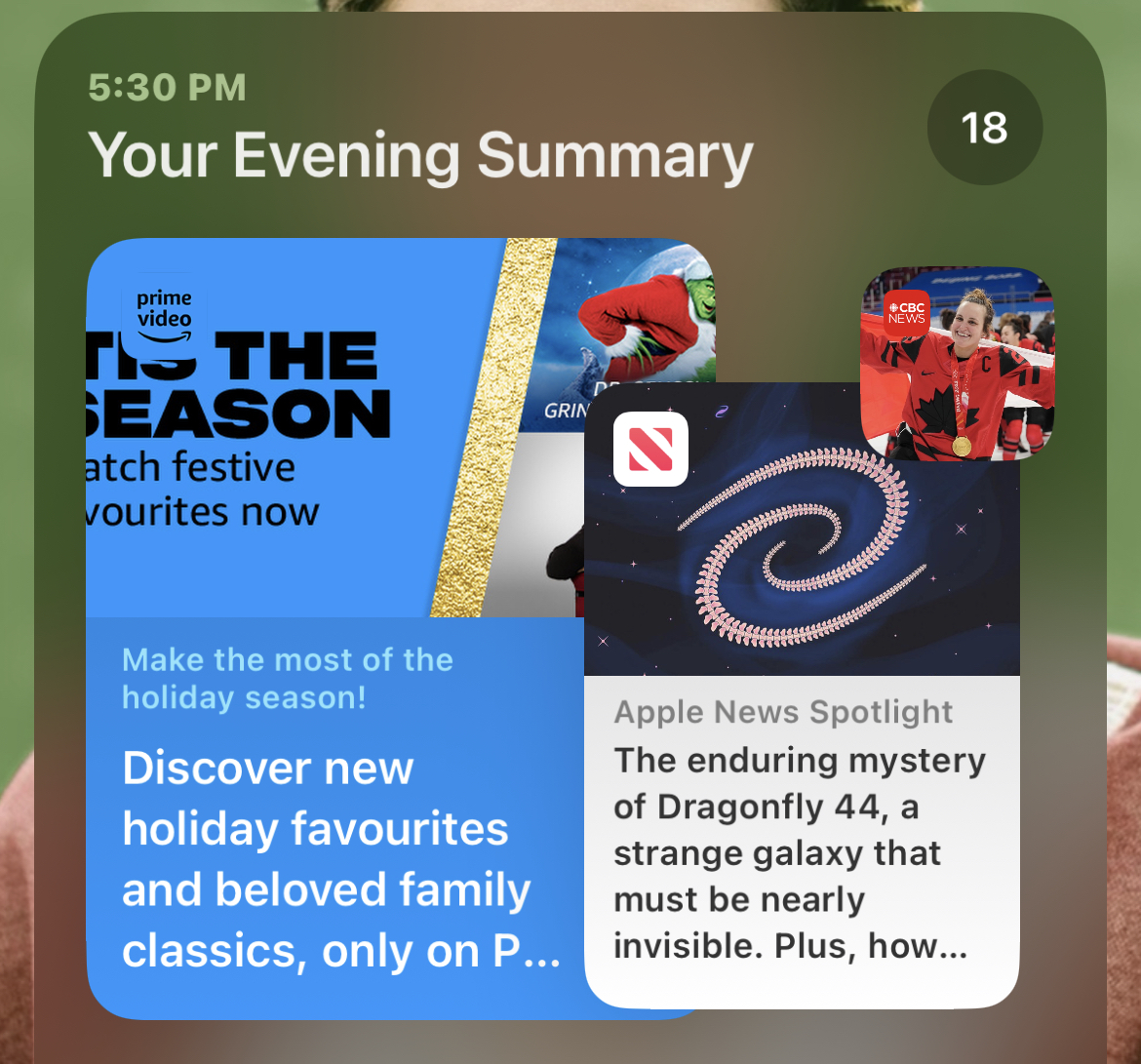
I’m kind of surprised about Amazon Prime’s redesign with black on blue. I’m sure they ran a contrast checker but I feel a white on blue is the friendlier and clearer choice. Even iOS’s notifications automatically choose white text for the brand of blue!